")


A new year equals new colour trends and a multitude of posts centred around the topic of whether all of our accessories should be a striking mint green, a lavender haze or perhaps a daring red. Colour is a huge part of our culture, defining our seasons and even our mood, so why should we limit ourselves to just the one?
As a lover of the bright stuff, I’m not really one for choosing just a single hue to determine my year and instead I’ve scoured some of my favourite design-led brands to determine a rainbow of products that could be featuring in the EJP abode this year. When you get to the end, why not choose your favourite colour as part of G . F Smith’s latest project? You could have your very own Colorplan paper created and named after you!
Revitalising Greens
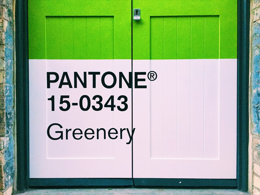
As Pantone’s colour of the year, ‘Greenery’ is probably the colour we’ll be taking note of most in 2017. It’s not an easy tone to pull off in the world of interiors, but it’s certainly a great pairing to some of the dusky pinks that we’re also seeing a lot of this year and works wonders in a Graphic Design setting. There’s been some dispute in the selection of the colour, but ultimately the message behind the refreshing choice is a good one and we should all consider the way in which we can bring this approach into our lives.
“The tangy yellow-green speaks to our desire to express, explore, experiment and reinvent, imparting a sense of buoyancy,” said Leatrice Eiseman, Executive Director of the Pantone Color Institute. “Through its reassuring yet assertive vibrancy, Greenery offers us self-assurance and boldness to live life on our own terms, during a time when we are redefining what makes us successful and happy.”
While I won’t be painting my walls green anytime soon, I like to think this colour can be added using actual greenery (something I can totally get on board with) and hints of the messaging in our lives. Planners, books and organisers make for the perfect accessories to redefine our goals in 2017.

1 // In The Garden book by Emily Rand | £6 | Hato Press
2 // Corocco Tray | £10 | Coming soon to Habitat
3 // ‘Journeys’ Writing as Therapy Journal | £15 | School of Life
4 // Pyramid Storage Box by Korridor | £19 | Moxon
5 // Tropical Leaves Wrapping Paper by Cynthia Kittler | £1.95 | Wrap Magazine
Pretty in Pink

1 // Watch Me Wall Clock in Pink | £34.90 | Normann Copenhagen
2 // Pink Print by Charlotte Walker | £12 | Department Store
3 // Flip Mirror in Blush | £69.90 | Normann Copenhagen
4 // Park Hill A3 Print | £20 | Laura Knight Studio
5 // Lugosi Vase | £20 | Coming soon to Habitat
Miami Orange
Orange is certainly a bold addition to any household but if you think about the summery connotations, it’s surely a great colour to lighten your mood and resurface memories of warmer times and climates. I’ve always thought that orange is an ideal colour for design projects and some of my favourite posters feature block colouring (think Whiplash and Clockwork Orange). This vibrant colour is the perfect way to add a hint of heat to your set up and an effortless approach to showing how brave you really are when it comes to fashion and homeware.

1 // Worlds End Estate Print | £45 | Oscar Francis
2 // Comme Des Garcons Wallet | £102 | Goodhood
3 // Sumo Pouf | £279.90 | Normann Copenhagen
4 // Orange Stripe Plant Pot | £6.50 | This Way To The Circus
5 // The Pantheon Print | £21.60 | Department Store
Effortlessly Cool Blue

1 // Large Pi Case | £22 | The Pattern Guild
2 // Small Lines Case | £16 | The Pattern Guild
3 // Nomess Blue Cork Notebook | £9 | Goodhood
4 // Round Da House No.1 Print | £120 | Camille Walala
5 // Hay Tote Bag | £12.50 | Goodhood
Super Super Yellow
Yellow is always the best way to add a statement to any form of design and you can bet that when paired with grey elements that you’ll have created some form of interior heaven. Spring always brings around the notion of adding yellow to your home but why not think a little outside the box? I’m thinking dramatic yellow staircases, neon bananas and bold prints to add vibrancy even on a rainy day.
Okay, so the stairs may just give you vertigo, but there are plenty of ways to add just a splash of the bright one to your life and lampshades and desk accessories are a great place to start. Remember it’s not just about items that are on show. Colour can affect you through the littlest of things and even just sending a card to someone can spread some cheer and change a mood.

1 // TA! Card | £3.50 | Jot Paper Co
2 // Banana Split Print | €54 | Playtype
3 // Peeta Lamp | £30 | Habitat
4 // Babylon Stapler by Samuel Wilkinson | £9.95 | The Z List
5 // HAY Strike Matchbox | £5 | Trouva
AND NOW, on to the fun part. I may have gone through a couple of the prism’s finest but essentially I want to know what’s turning you on today. What is your favourite colour? Will you be going goo-goo over Yves Klein Blue like Ms Walala or fantasising over Slime Green like Harry Parr? I went for Palin Pink (duh) but be sure to share your own selection with me.
COMMENTS +