Thinking about creating your own 70s style office? Here’s how I’m designing mine with a music studio and guest bedroom twist! This post contains affiliate links and anything marked with an * means I make a small commission if you purchase through me.
It’s been a long while since I last touched base and if you’re not following me over on Instagram, you’ve probably been wondering where on earth I’ve been. Well, if a global pandemic wasn’t enough to keep me working my ass off, renovating a caravan, buying my first home and getting married was. Updates coming on all of the above soon, I promise.
As Christmas rolls around the corner, it seems I finally have the headspace to get started on the house (it’s been over a year since we put our offer in!) and the first room I’m getting cracking on with is the home office / studio. This is one of my favourite rooms in the house and while it is the smallest, it has an amazing floor to ceiling window and some large in-built storage which makes it ideal for the multi-functional room it needs to be. I say home office / studio and realistically I mean office meets music studio, meets walk-in wardrobe, meets guest bedroom. We’re really stretching the functions with this one. Here’s the before…

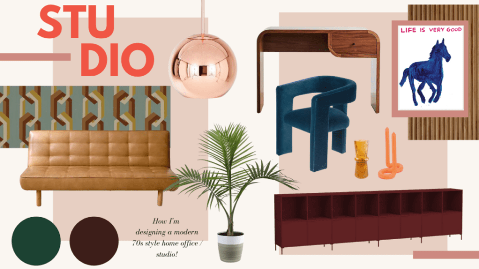
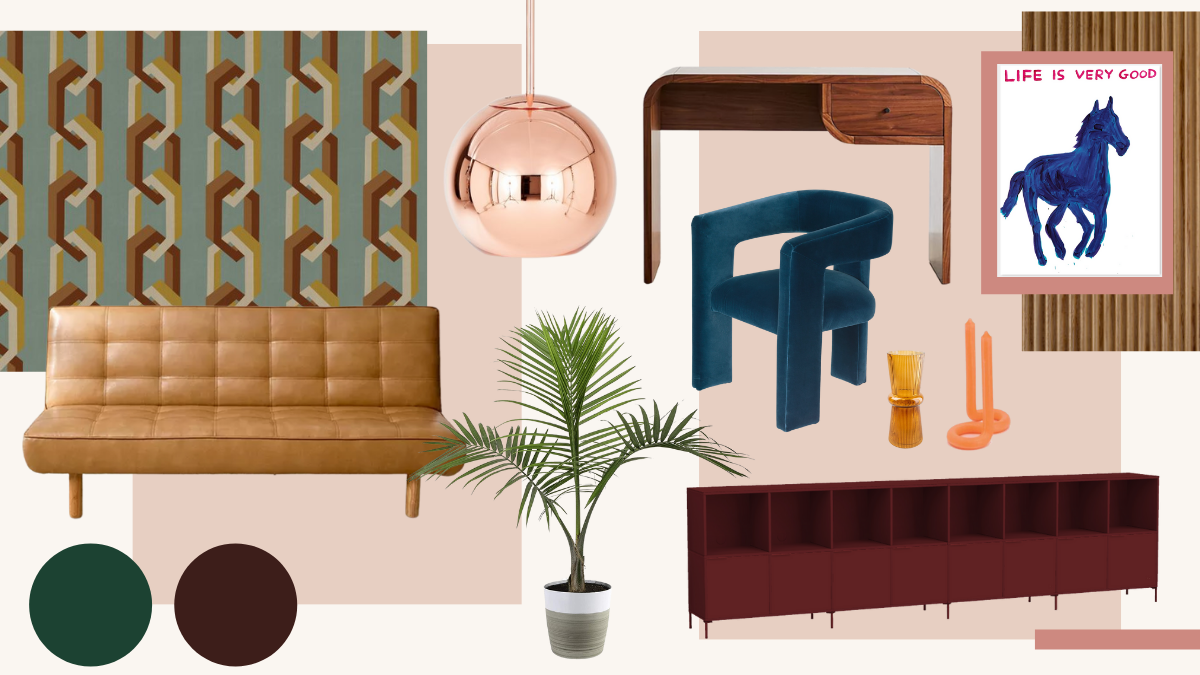
As I now have my own studio space down the road (another 2021 update), this room is generally speaking more for Josh to work on music (and for me to hang out in and learn guitar as per my 2022 resolution). Designing with JJP’s needs in mind has meant that I can be a little more creative and think less about whats needed to make work at a laptop productive. The space doesn’t need to be light, bright and airy; it can be moody and rich in colour. Think modern Mad Men where the offices literally are made for working, playing and sleeping. I’ve popped some of my inspiration for you below to peruse.
Now that I’ve shown you some of the inspiration behind my vision, why don’t we delve into my actual plans. Unlike, the majority of my pinned images, we don’t have a huge space or endless budget to work with, so we’re very much bringing this to life with things that we already own, or DIY hacks. Living in a new build gives us a great base and we don’t have to do any structural work or much prep work, so this is very much a decorate and go room. Want to know more? Here’s how I’m going to create a modern 70s style office in the EJP abode…

Embrace a rich colour palette
Anyone that’s been around here for a while will know that I’m a huge fan of an earthy and muted colour palette – pink, orange and brown is my jam. These were easy colours in a rental as they could be painted over easily, but I’m now looking to be a little more experimental with colour and I don’t want the whole house to be plucked from the same colour charts. For the office, Im tapping into moodier colours that work in a dimly lit room, but won’t be too dark and dingy. I’m thinking rust reds and dark teals mixed with blue and terracotta. I’ve always been heavily inspired by Bella Freud’s design for the TV Centre and these kinds of colours are also frequently seen in the likes of the Soho House franchise.
Hang a statement wallpaper
One of the beautiful things about owning our own home is the fact that I don’t have to worry about removing things, or painting over them. While I’ve been lucky enough to go to town on the majority of our rentals, I’ve still had to limit myself style wise as I’ve never known how long we would be staying in the same place. Wallpapering is fun, but removing it in a rental? Not so much.
You know that I’ve long been a fan of Poodle & Blonde, so it was a no brainer for me to include my favourite print somewhere in the house. The ‘Chain of Fools’ style is oh so 70s but still feels the right side of retro. As soon as I saw this room, I knew I wanted it to be wallpapered in Chain of Fools as the vertical chain lends itself beautifully to the longer room. We don’t have the highest ceilings in the world so this will also help to bring a little bit of height to the space. The ‘Jade’ colourway, consisting of a blue / green base paired with warm tobacco and ivory, lends itself beautifully to my chosen rich colour palette.
Paint the ceiling
Ever since the pink ceiling moment in my rented office, I’ve loved a statement ceiling moment and this time around will be no different. In a bid to be dramatic, I’m trialling a deep rust red ceiling using ‘The Old Corset Factory’ by Coat Paints. I have a leftover tin from another project and conveniently, it matches the deep red in the Poodle & Blonde wallpaper to a tee. A word of advice that dark ceilings do tend to bring the room in on itself a little and I normally wouldn’t choose to do this in a home with lower ceilings, but as the vibe here is cosy and the wallpaper is elongating, I think it will work out for the best. Fingers crossed!
Incorporate fluted wood detail
One of the consistent themes throughout my pinned images was a slatted wooden wall that is a feature in almost every 70s home. I don’t know who made these or where they got them from back in the day, but to buy a ready-made slatted wall panel in 2021 costs the bomb. Thankfully, I’m not adverse to getting savvy with my hands and having previously created my own fluted cabinet, I’m going to try and cheat the system. I have two options here: 1. Use the back of flexible MDF as a ribbed feature or 2. Use the back of tongue and groove which is also ribbed. I’m yet to work out which is more cost-effective so will report back when the room is finished and let you know!
Add mid-century storage
Judging by the fact that until now this room has been a miniature graveyard for everything we haven’t found a home for, we need storage, much more storage. The room is already home to a large built-in wardrobe which is filled to the brim with coats and knitwear, so we also need somewhere to house office supplies and general admin bits. As opposed to building anything else in the room, some long freestanding storage will fit the bill and act as a place to style up objects on top. I’m even going to try and squeeze some of our ever-expanding t-shirt collection in drawers.
When it comes to freestanding storage, there’s only one place I will look – Tylko*! We’ve had our incredible vinyl storage from them for three years now and it’s moved with us twice. I love that you can really fit the storage to the space and build it depending on your needs. For the office, I’ll again be going for something long and relatively low, but with legs to bring something a little different. We’ve chosen the gorgeous new burgundy shade to tie into the wallpaper.
Work in a desk and sofa bed
Like I said, this room needs to be multi-functional and both a desk and sofa bed are a must. Our previous Alex desk from IKEA was damaged in the move and I’m currently in a debate with myself whether to revamp this, or cave and buy a new desk. The Aria Desk* from Urban Outfitters is beautiful and really fits the brief. We’ve already bought the Brenna Sofa Bed* which is in itself quite large, so I think it will be a case of seeing how it all looks together in the room once the Tylko is built. If I do go for the former option, I’ll probably look at creating a new desktop to cover the damage. It’s certainly a DIY that I would like to try, so let’s see what happens once the decoration is done. Feel free to let me know your thoughts.
Use statement lighting
We’ve had our Tom Dixon copper pendant* for a while now (pinch me) and I always imagined it hanging in this room, even before we moved in. We had our electrician install it almost immediately on moving, so that’s not going anywhere although it is a little bit low so we need to shorten the wire. I cannot wait to see it reflecting the wallpaper all around the room and am already extremely happy with the warm 70s glow it brings. I’m also on the hunt for a floor lamp for in here, but will likely leave this to the end depending on room. It’s really important to me that this room doesn’t become overcrowded or look too much (a hard feat when it’s being used for so many different things). I’ll also have the space on top of the storage to make use of, so a table lamp may suffice.
Style minimally
As above, I still want this room to feel considered. I don’t want it to become a dumping ground for everything in our house. There are a number of things that I know I want to include as styling pieces such as Josh’s guitars and his amp. These already add to the visual, so I won’t be buying anything new. As usual, I’ll use books, photographs and magazines to make it personal. In terms of art, I want the wallpaper to do all the talking so I only have one piece in mind for this room – a horse print from David Shrigley’s print shop which makes use of blues and reds. I’ll likely hang this on the ribbed wall as I’m too scared of putting anything on the wallpaper!
Consider different window dressings
One of the main areas where I’m still thinking about what to do is the window. To curtain wall, or not to curtain wall, that is the question? The window in this room is one of the main selling points for me and while leaving it completely obstruction free is unfortunately unavoidable, I want to make sure you can see as much of it as possible. We have previously had voiles over just the window itself, but I’m wondering if a curtain wall would be more impactful. This is another one that I’ll leave until the last minute and you’ll have to wait to see the end result.

COMMENTS +