")


The Weekly Wall | #014 | Peckham Levels
95A Rye Lane, Peckham, London, SE15 4ST
Nearest Station: Peckham Rye
There’s a new colourful stairway in town and while located closely to the Baker Miller Pink walkways of Frank’s, it’s a whole new experience entirely – one that may even bring a little healthy competition. Welcome to Peckham Levels, a community hub offering studio space, unique street food and a place to hang at night.
The bad news is that this is a temporary project. The good news? It’ll be around for at least six years. Created to provide affordable and inspiring space for independent businesses, artists and local entrepreneurs to work, grow, trade and learn, the grassroots project will occupy the unused car park space for the foreseeable future, growing and developing as the community sees fit. The lower floors hold said studio space and the cultural destination ultimately aims to showcase these members to a wider audience and connect them with the wider world.
Even more excitingly for the public, the top level provides a space for the community to thrive with some of the best street food (looking at you vegan pizza from Picky Wops) and some seriously cool interior design at Near and Far bar. There are also some great colourful features in the event space with traditional local fabrics acting as screens and 3D shapes making for some rather snazzy seating.
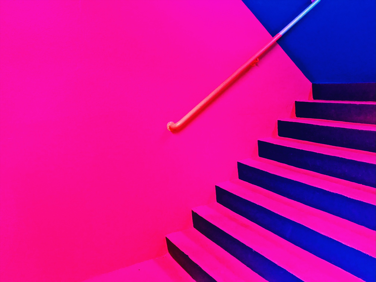
Now, back to those stairs. Designed by AO Architecture, the graphics you see and experience within the stairwell are an amalgamation of the building levels and the colour coding system. As visitors move up and down the stairwell, the colours that surround them reflect the levels of the building. This is what drives the split colour coding on the entrance landings and full-colour coding on the half landings. From Yellow to orange to pink to blue and green, the split nature of the graphic is designed to help people understand which level they are entering and which they are leaving. Design communication at its best.
The handrails are also split in colour to help with direction. The colours point towards the levels above and below so that visitors know which direction to head for that level. These colour coding and graphic forms have been designed as a wayfinding system which can be easily scaled from a two-dimensional graphic for informational or marketing purposes to a three-dimensional spatial experience within the stairwell, the ramps, and the building itself.
Mostly though, the experience is highly instagrammable and we all know that’s equally important. Get there quick before the muddy footprints descend and be sure to try out all the grub while you’re there.
COMMENTS +