")
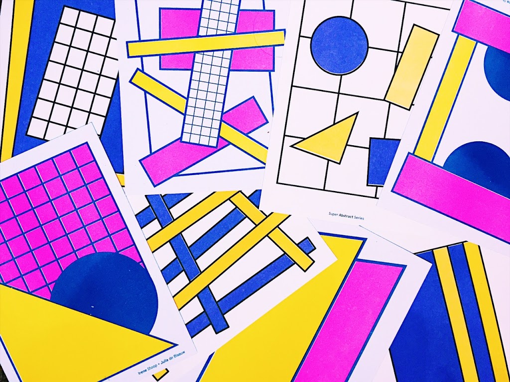


A couple of weeks ago I had the pleasure of introducing you to the Super Abstract ladies as part of my ‘Six Amazing Instagram accounts to follow now‘ post. While researching the girls, I came across their store, fell in love even more and quickly nabbed myself a set of their insanely lovely risograph prints. While frantically noting that I needed to feature these babes even more on the blog, I waited patiently for my prints to arrive, only to learn that they had sent me two sets to say thank you for the Instagram lovin’ – it’s a rare occurrence but something I always really appreciate.

Would you say that your designs are experimental or do you think beforehand about they type of image you are going to produce?
J: Very experimental! Sometimes we’re just in the mood for triangles, polkadots or pink, or we want to try out some new colour combinations. Most of the abstractions on Instagram are made in less than 30 minutes. When it takes more time to create an abstraction it feels like less of an intuitive experiment.I: The posts on Instagram are purely experimental. It’s a good practice in design and composition for us to post daily. When we’re designing a print series on the other hand we think upfront what kind of abstractions we want to use and look good on print.
What gets you in the mood for being creative?
I: Trying out new colour combinations gets me so super creative. My daily job as a Graphic Designer at an agency is quite commercial. Often (after work) I feel the need to be more artistic and free in my work.J: To be surrounded in Amsterdam by pretty places, colours and art gives me a lot of inspiration. It’s also important for me to discover new work, styles and see as much art as possible. Constantly finding new styles and techniques keeps me going.

Can you name your biggest inspirations?
We both love the work of designers: Ricardo Leite (NL), Atelier Raphael Garner (FR), Mainstudio (NL), Team Thursday (NL), Linda Linko (FIN), Marcello Velho (USA), Spechtstudio (BE).
What’s the colour that’s really exciting you for 2017?
I: Beige; the nude, natural, yellowish kind.J: I love bright colours. That’s great about techniques as riso printing or silkscreening: the colours are super bright, nothing like on your digital screen. I’m going to choose jungle green for 2017.
Circles or squares?
I: Circles, because they’re more fluent and easier to create good compositions with.J: I can’t choose. I remember this was a question once at school and I panicked because I felt sorry for the squares if I chose the circles. Still feel this way, love them equally.

If you could see a Super Abstract pattern anywhere in the world, where would it be?
I: Somewhere in the public space. As long as it has some kind of value for people in their daily lives, instead of just being decorative. Some super abstract traffic signs for example would be great.
J: I would like to cheer up the most boring or unappreciated places in the world. Like office buildings, underground stations, deserted area’s or failed public squares. Maybe to give them more value or to just bring them some super abstract vibes.
Can you give me three Instagram accounts that we should all be following?
Find out more about the girls by following them on Instagram and purchasing their prints. What’s your verdict on these super abstract prints? Oh, and the most important question of the day, circles or squares?
COMMENTS +