")

Within the interiors world, we’re always looking for the next ‘on-trend’ shade to plaster the walls with and from Pantone’s Colour of the Year to G . F Smith’s search for the World’s favourite colour, 2017 has been pretty big for talk of tones, shades and hues.
Adding fuel to the fire is Norwegian paint manufacturer Jotun, who have just launched their annual colour card, a culmination of a year of global lifestyle research and the unveiling of 32 shades that are set to define interiors for 2018 (yes, already).

“Colour and life experiences go hand-in-hand. Jotun therefore has a responsibility in that we use colours to create surroundings. There is a real potential to create memories through the use of colour.”
~ Lisbeth Larsen, Global Colour Manager at Jotun
Entitled ‘Rhythm of Life’, the latest colour card is a look at the ideas, values, dreams and realities shared by people around the world, developed in response to the changing nature of international living.
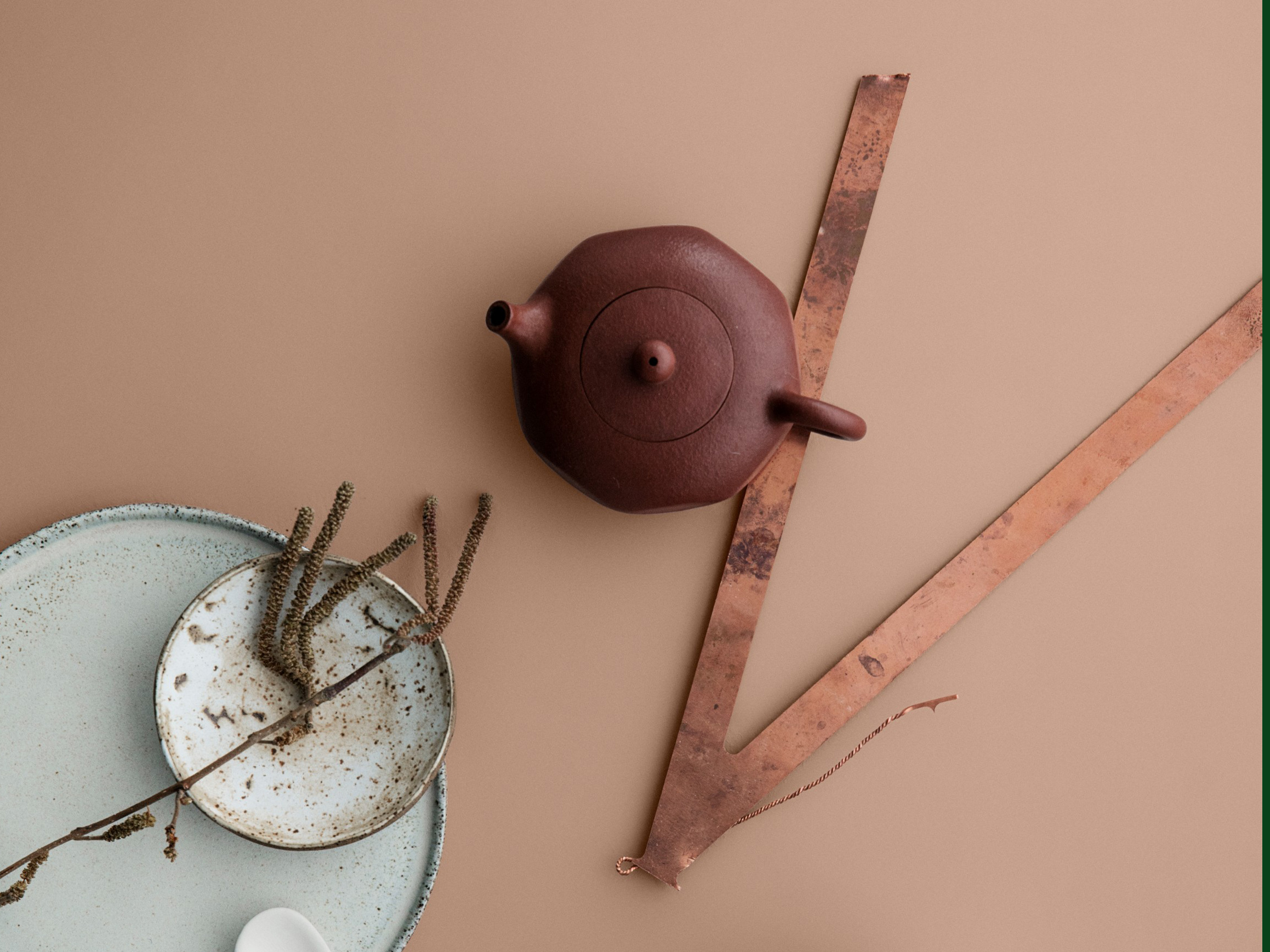
Split into three wonderful themes, the colour card provides valuable inspiration but also a chance for homeowners to mix and match styles, using the card as a reference for combining the perfect saturated colours. The paint company have also enlisted the help of Oslo-based creative studio Krakvik & D’Orazio and renowned photographer Line Thit Klein to bring the three palettes into real life. The beautiful styling made this a must-feature for me and you can absolutely thank me later for the drooling you’re about to endure.
City Motions

Colours include: 5455 Industrial Blue, 5044 Icy Blue, 5200 Dusky Blue, 5452 Nordic Breeze, 1434 Elegant, 1877 Pebblestone, 1973 Objective, 1391 Bare, 10981 Norwegian Wood, 10965 Hipster Brown, 10961 Raw Canvas

City Motions represents modern urban creative culture, expressed through the pared back design of compact city living spaces. While created with Nordic living in mind, the palette is perfect for London lifestyles, fusing an industrial aesthetic with comfort and simplicity. The theme presents a refined and restrained palette of deep blues, marble greys and woody browns – perhaps one that more landlords should take note of as opposed to the standard EJP-despised Magnolia.
“City Motions is all about how to survive in our busy city lives. It’s architectural and minimalist, but still down-to-earth – a relaxed and urban style with handcrafted details and an environmentally-friendly focus. The blues create a calmness, complemented with materials such as wool, linen, leather, velvet stone and ceramics”
~ Kråkvik & D’Orazio, Set Designers
Silent Serenity

Colours include: 10981 Norwegian Wood, 20046 Savanna Sunset, 20047 Blushing Peach,10580 Soft Skin, 10678 Space, 10966 Almond Beige, 1024 Timeless, 10965 Hipster brown

Peachy pinks have certainly been on the spectrum as one of the most popular colours of the year making Silent Serenity a beautiful choice for updating the home with some on-trend colours. The palette embodies the meeting point of mindfulness and multiculturalism and features the light shades of earth and sand – soothing creams, desert pinks and muted peaches.
“Silent Serenity and its beautiful peachy pinks and earthy browns creates a peaceful and relaxed atmosphere – think organic vegetables and slow living. We have mixed different cultural pieces including old pots, iron, baskets and ceramics. All are handcrafted in different natural materials: linen, wool, stone, natural leather and terracotta.”
~ Kråkvik & D’Orazio, Set Designers
Lush Garden

Colours include: 5454 Dark Teal, 8493 Green Tea, 8281 Pale Linden, 20054 Silky Pink, 6351 Tender Green, 8494 Organic Green, 8302 Laurel, 6352 Evening Green, 2588 Artist Clay, 6350 Soft Teal, 2727 Red Maple, 20055 Dusty Rose, 0963 Golden Bronze

Botanical is back, as if it ever went away, with Lush Garden taking us out of the city and into the forest, representing the grounding and restorative connection with nature and offering a botanical sanctuary from the relentless pace of life. The blues-greens of leaves and jungle pools are contrasted with the red-browns of bark and branch.
“Lush Garden is all about the desire to surround ourselves with nature. It allows you to play with colours and botanics and is playful in its style. We chose to focus on the natural habitats from the sunnier parts of the world, for example, Vietnam and Malaysia, always balancing it with the more modern interior. The theme has a fun mix of colours, huge plants, fun flowers, ethnic and vintage objects, and natural materials including linen, silks, basket and ceramics”
~ Kråkvik & D’Orazio, Set Designers
So, how do you think 2018 is set to look? Do you agree with these colour choices? Leave me a comment below – personally, I’m all guns blazing for Silent Serenity!
All photography by Line Thit Klein, set design by Krakvik & D’Orazio
COMMENTS +